 |
| cover photo book |
So I decided to draw them myself with the aid of a template, not on the cover but on the very first page when you open the book. The cover was quite glossy and I wasn't sure wether the gold of the marker would stick to it.
 |
| 50 years in gold |
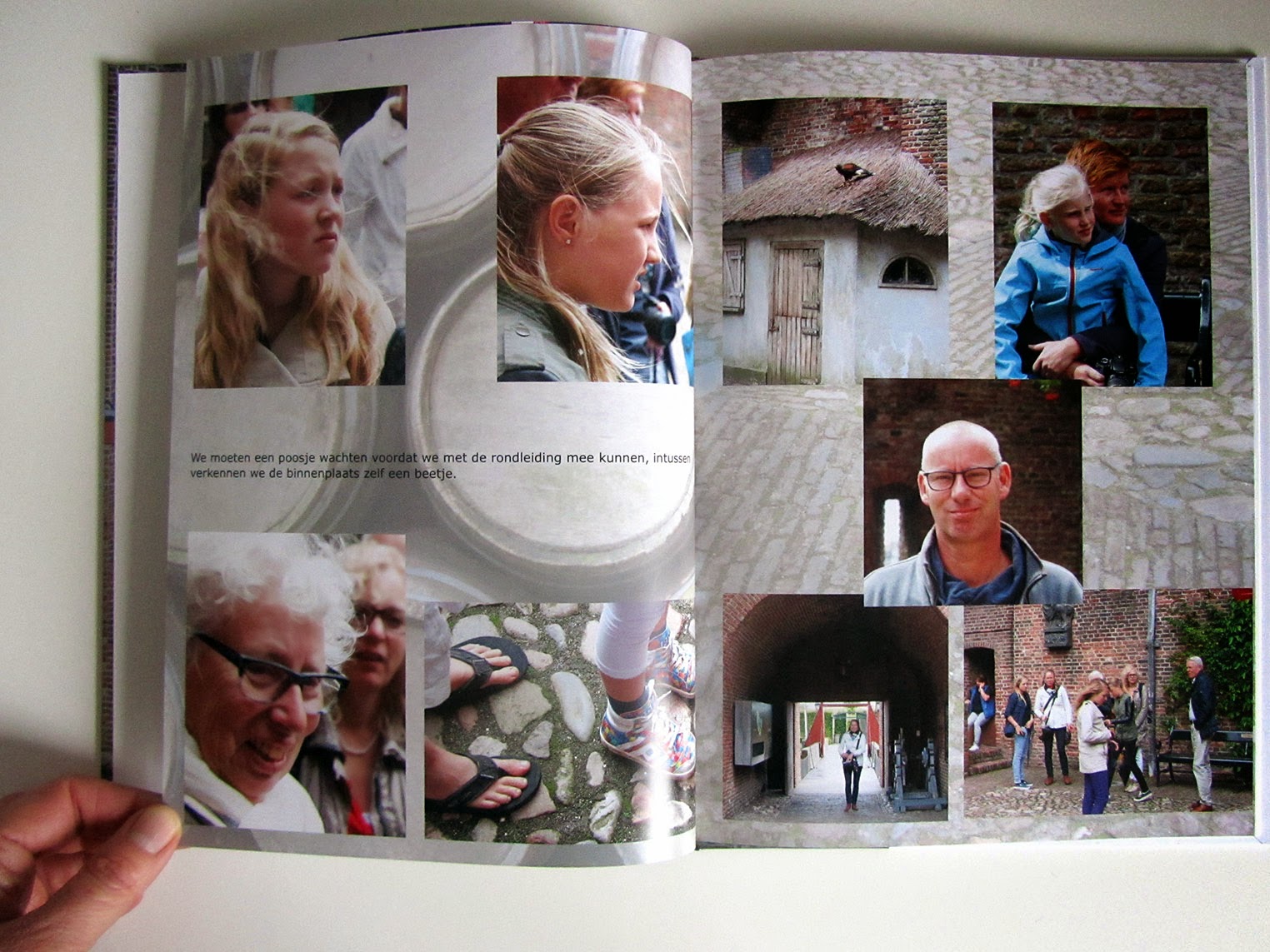
Inside the photo book I used different templates: existing and created ones. When we were at the castle I saw this picture of a swordsman and I knew immediately then that I wanted to create a spread with all of us on it. I very much like how this page turned out.
I grouped pictures around a little theme on the pages and switched between colour and black & white. The latter I used for pictures which were technically not that good or where colour was not relevant to the image. I also quite like this mix and match.
During the visit of the castle I noticed that the kids loved dressing up, that became a spread too.
On the blogpost of the visit of the castle itself I don't show any pictures of where we stopped on the way back: the Afsluitdijk. It is one of the major dikes in Holland connecting the west and the east of the country. From a distance you can see the cityscape of Amsterdam.
I wrapped the photo book and sent it to my parents. Last night they called me to say thank you in a big way, they were overwhelmed by it. They loved how it captured the atmosphere of the day, the diversity in lay-out, the quality of the book, the clarity of the pictures and that we were all portrayed in the photographs. Well, if that is not a great compliment I don't know what is!
This book is made with Vistaprint.


Beautifully done!
ReplyDelete